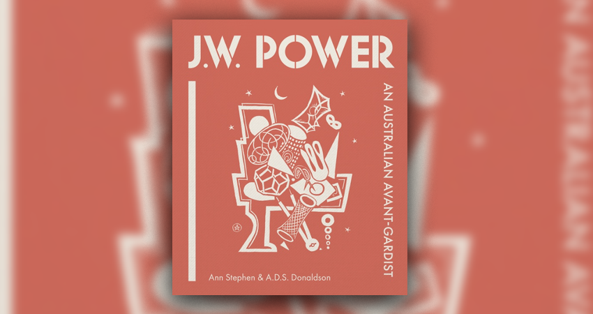
Review: J W Power: An Australian avant-gardist, Ann Stephen and A D S Donaldson, National Library of Australia
J W Power is – or at least was – one of our most neglected artists, yet one of the most important, because of the innovative quality of his art, his influence on European artists through his paintings and writings, and his substantial bequest to the University of Sydney for the promotion of modern art.
The current exhibition at the University of Sydney* aims to reverse this neglect, and it is accompanied by a substantial but reasonably priced art monograph with nice heft, luminous reproductions that pop off the page, and text that engages substantially with his life and work.
Power grew up in Woollahra (his father was a prominent architect). His youthful sketchbooks show exquisite rendering of detail and colour (50 or so of his sketchbooks survive, including ones from his last years on German occupied Jersey during WWII), the subject matter including Sydney Harbour. He studied medicine and, as often happened in those days for people with money, he soon travelled ‘back’ to England, where he spent a decade as a doctor.
Turning to art full-time, he quickly became part of the Bloomsbury modernist set, which included Vanessa Bell and Duncan Grant; he exhibited alongside Matisse and Derain and amassed a large modern art collection which he hung in a 10-bedroom house he bought. Reviews of his art were mixed, with some bristling at French influences and his antipodean origins, while others praised his confident lines and composition.
In the 1920s his style was post-Impressionist and expressionist, but by the late 1920s it began to fracture, influenced by Cubism, but with a sophistication of shading and colour. In 1928 he was included in a Hamburg exhibition featuring the cream of modernist European painters; by the 1930s, while English artists looked to France, Power moved there, possibly pushed by the provincialism of English critics. He studied as a mature-age student at Ferdinand Leger’s school, where he learnt Leger’s avant-garde approach to the geometric, classical figure, which Power eventually described in an influential book of art theory. One of his contemporaries, whose work appeared on the cover of the infamous Nazi ‘degenerate art’ exhibition catalogue, said Power kept to himself but was an ‘artist of great value’ who was ‘opening up new perspectives for art’.
His immersion in the European art world led to him being largely ignored in Australian art history. The likes of Robert Hughes noted his skill and thought he would have been one of our most prominent artists had he stayed in Australia but otherwise wrote him off in the Australian context. There is some logic in this, as his work is unlike other Australian artists who stayed and worked through a modernist vision of Australian themes, yet there are plenty of Australian artists who worked in the areas of abstraction and had few recognisably Australian motifs. The authors of this monograph also note that his obscurity has been perpetuated unintentionally by his wife’s bequest of most of his paintings to one institution – the University of Sydney – rather than them being widely disseminated, even though he was prominently exhibited in his day.
Despite his precision, his canvases show rhythm and playfulness. Like Picasso and Braque, he experimented with materials, but, unlike them, he included landscapes in his Cubist works. When Dali was becoming famous, Power was also producing ‘melting’, morphic forms, but closer to Cubism. At the time, there was some opposition between Surrealism and Cubism – Power negotiated between the two, gradually moving from Cubism to what the authors of this monograph call his unique blend of abstraction and Surrealism.
Dancing is a prominent theme in his works – he makes much mileage from the yin and yang of dancing couples. Elements ‘fold, wave, peel and loop’; each canvas is a carefully planned riot of forms, hinting at the body or flowers. He participated in the vogue for biomorphic forms, informed by scientific studies of the likes of spirals in nature. The authors think his Cubist portraits of the late 20s may have been portraits, either literal or metaphoric, of the distorted faces of war victims. The play of carefully chosen yellows against greys and reds against dark blues reinforces the dynamism, while in ‘Tableau Abstrait’ we see a more subtle use of pastel colours, recalling the art of Hilma af Klint.

His painting of the biblical story of Susannah and the elders, a common theme across Western art history, is a gripping example of his style – it has a vaguely V-shaped design, the two elders are cylinders with goggle cyclops eyes, Susannah is a ribbon of pale pink skin swirling to outline a female form, partly shielded by a shell-like red form that resembles a prawn cracker. A small, dark shape reaches menacingly around it towards the bathing woman.
*J W Power: Art, war and the avant-garde is exhibiting now at the Chau Chak Wing Museum at the University of Sydney until February 8.
Nick Mattiske blogs on books at coburgreviewofbooks.wordpress.com and is the illustrator of Thoughts That Feel So Big.